[Case 01]
Profit Max Platform
Supply Chain

Profit Max: Turning Distributor Data Into Strategic Advantage
Transforming raw operational data into confident, high-impact business decisions.
PROJECT OVERVIEW
Every distributor sits on a goldmine of data: thousands of products, orders, sales, costs, margins and customer interactions flowing through their systems every day. Yet, most of this data remains untapped, buried in complex ERPs and inaccessible without specialized tools or teams.
Profit Max Platform changes that.
Built to turn complexity into clarity, Profit Max transforms raw ERP data into clear, prioritized actions. Powered by AVA, its AI-driven intelligence uncovers hidden margin leaks, pricing gaps, and performance trends in real time, helping distributors move from guesswork to confident, data-backed decisions.
At its core, the platform is driven by a simple belief: when distributors truly understand what drives their profits, they unlock the ability to act faster, smarter, and with far greater impact.
The client, based in Grand Rapids, has several cloud solutions, including this product.
[Industry]
Supply Chain
[My Role]
UX/UI Designer
[Platforms]
Desktop
[Timeline]
June 2023- April 2024
PROBLEM STATEMENT
Despite sitting on a goldmine of ERP data, distributors struggled to turn information into meaningful, profit-driving actions. The existing product surfaced data but failed to deliver clarity, direction, or confidence to make smart decisions.
Data Without Direction While the platform exposed vast amounts of data, it lacked the intelligence to translate it into clear, prioritized actions. Users were left guessing what mattered, missing the opportunity to quickly identify margin leaks, pricing gaps, or performance trends.
Overwhelming Interface, Limited Clarity The interface presented a dense wall of KPIs with little to no information hierarchy. Instead of guiding users, it created cognitive overload, making navigation tedious and slowing down decision-making.
Metrics That Don’t Speak the User’s Language Key metrics were displayed without context or intuitive framing. Users couldn’t easily understand why a number mattered or what to do next, leading to confusion and disengagement.
Ineffective Data Visualization Charts and visual elements lacked clarity and usability. Instead of simplifying complex data, they added friction, making it difficult for users to interpret trends or extract actionable insights.
Insight Gap → Action Gap Ultimately, users were presented with a flood of data that didn’t always make sense to them. Without clear insights or guidance, the platform failed to bridge the gap between information and action limiting its impact on profitability.
PERSONA
CEO/ Business Owners
Need to know numbers across all aspects of their business. They are not necessarily savvy with BI/ analytics tools nor do they have IT/ Analytics resources to create dashboards and extract insights.
Goal
To be able to understand the company performance over time.
To process many aggregate numbers at a glance.
Understand which items and customers are doing well.
Frustrations
Data is located at different places.
It's difficult to decipher the meaning behind the numbers presented.
Limited understanding of factors influencing under-performance or over-performance.
INITIAL CONCEPT

The client hosts an annual conference for their customers, where they wanted to showcase the product's north-star vision. We had just two weeks to conceptualize and design an experience that was both compelling and easy to grasp at a glance.
The focus was on clarity, simplicity, and guided exploration. We designed a single-page dashboard that surfaces key information upfront, with deeper layers revealed progressively through modals. This allowed users to access details on demand without being overwhelmed by dense data.
To further support intuitive navigation, we moved away from conventional patterns and introduced a horizontal layout. This helped guide attention naturally from left to right, creating a more structured and digestible flow of information.
WIREFRAMING & IDEATION
With a clear understanding of our end users’ most common workflows and painpoints, I kicked off the design process with wireframing, laying the foundations for Cashier UI’s most essential features.

LAUNCHING V1
Following the strong response to the north-star presentation at the conference, we moved into designing for the beta release. With a few months in hand, this phase focused on refining the experience and establishing a more cohesive design language for the product.
We revisited the initial concepts to identify gaps in usability, data visualization, and overall clarity. This was a highly collaborative effort, working closely with the product manager, developers, and data science team to ensure the experience was both intuitive and technically sound.
While the core idea remained intact, several key improvements shaped the product:
We moved away from the single-page dashboard approach, which relied heavily on multiple modals and disrupted the user’s flow.
We refined and introduced more meaningful KPIs that better supported user decision-making.
We re-evaluated our data visualizations, replacing less effective options like scatterplots with clearer, more accurate representations.
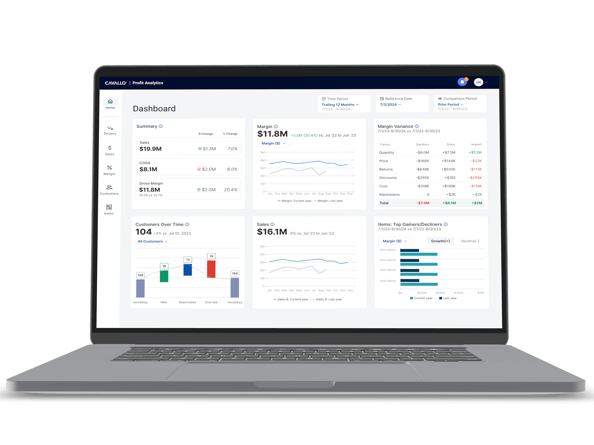
A major focus during this phase was strengthening one of the product’s key differentiators, Margin Drivers. This feature was designed to clearly show what’s working, what isn’t, and where exactly the problem lies, enabling users to take targeted action.
Before diving into detailed designs, we also established a clear information architecture. This helped us define the core screens, structure key features, and create a more scalable and intuitive foundation for the beta experience.
HOW THE PRODUCT REALLY HELPS
Q: How is my business performing right now and what needs attention?
A: Profit Overview
Your Business, At a Glance
Track key metrics in one place and uncover what’s driving performance. Identify risks early, spot opportunities faster, and take action where it matters most.

Q: Which products drive profit—and which ones hurt us?
A: Product Intelligence
Product-Level Insight for Profit-Level Impact
Cut margin drain and double down on what drives profit. Rank products by real value, and turn your sales and margin data into clear, daily actions that help you fix faster, promote smarter, and grow with precision.

Q: Why are my margins going up or down?
A: Margin Drivers
Understand What’s Really Happening
Quickly see what’s working and what’s hurting your margins. Dive deeper into the drivers behind each change and focus on the areas that need attention.

COLOR SYSTEMS FOR ACCESSIBLE VISUALIZATION
We established a dedicated color system for data visualizations to ensure accessibility at scale.
To address this, we created a visualization-specific color palette inspired by Paul Tol’s Notes, ensuring charts remain clear and distinguishable across different types of color blindness. By focusing on contrast and balance, we made data easier to interpret for all users.

AFTER-THOUGHTS & KEY LEARNINGS
Every project brings its own set of learnings, and this one was a significant growth experience for me.
Being the primary designer from the start pushed me to take ownership, communicate more confidently, and better understand the needs of different stakeholders. It also helped me become more comfortable articulating design decisions and aligning them with business and user goals.
Collaborating closely with product, engineering, and data teams gave me a broader perspective on the product. It reinforced how important it is to understand the bigger picture, not just the interface, but the underlying problems, constraints, and opportunities.
A few key takeaways from the process:
Clarity starts early: Quickly translating requirements into wireframes helped gather fast feedback and align everyone early on.
Design is negotiation: Working with strong stakeholder opinions wasn’t always easy, but presenting thoughtful alternatives helped drive better outcomes.
Think beyond screens: Understanding the overall product vision is essential to making meaningful design decisions.
Most importantly, I learned that no product starts perfect. It evolves through iteration, feedback, and continuous refinement. The goal is not perfection from day one, but steady progress toward a better user experience.